 HTML to Frames
· 3 min read · Mert Tati
The UI/UX Design Process: From Idea to Product
Discovery, research, user flows, wireframes, prototypes, UI design, design systems, testing and developer handoff: the UI/UX design process, step by step.
Most projects that start with “We want to build an app” are won or lost long before the first screen is drawn. A good UI/UX process helps you find the right problem, test solutions while they’re still cheap, and go into development with a consistent system. Here’s the design journey of a digital product, from idea to launch.
1. Discovery: the problem, the user and the business goal
It starts with stakeholder interviews, a review of existing data and a competitor analysis. The output is a short discovery document that spells out project goals, success metrics, target user definitions (personas) and constraints. At this stage, deciding “what we won’t build” is just as valuable as deciding what we will.
2. Research: user interviews and journeys
Short interviews with real users quickly correct wrong assumptions. User journey maps show the steps users take to reach their goal, how they feel along the way and where they get stuck. If there’s an existing product, analytics data and support tickets feed into this map too.
3. Information architecture and user flows
This is where we decide how content and features are grouped, how navigation is structured and how users move between screens. Flow diagrams make it visible how many steps each scenario (say, “first order” or “password reset”) takes from start to finish, and unnecessary steps get cut here.
4. Wireframes: content and layout
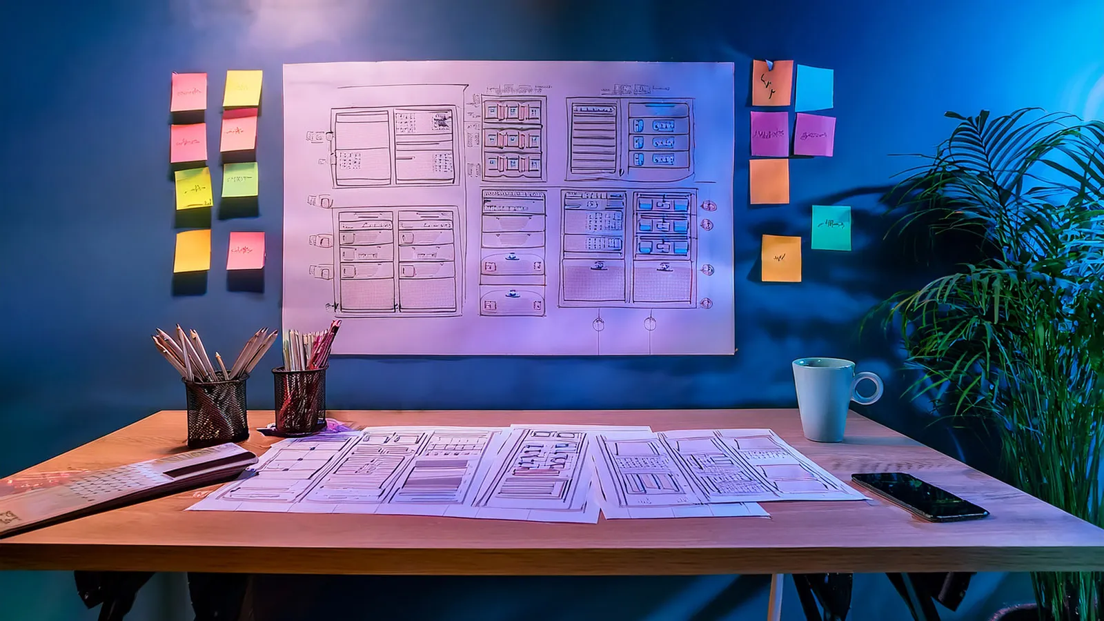
Low-fidelity screen sketches (no color, no imagery) shift the conversation from aesthetics to structure: What information sits where? Is the hierarchy right? Is there too much on one screen? Wireframes change fast, which is exactly why they’re cheap.
5. Prototyping and user testing
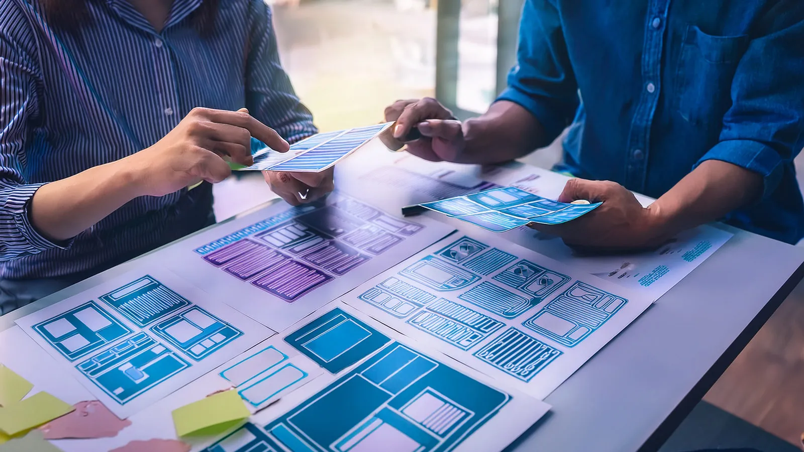
A clickable prototype in Figma lets people experience the screens as a real flow. Short task-based tests with five or six users uncover most of the biggest usability problems. Findings go back into the wireframes; this is the point where iterating costs the least, before a single line of code is written.
6. UI design
This is where visual decisions about brand language, typography, color, spacing and components are made. Every screen and state (empty, loading, error, success) is designed, and responsive behavior is defined. Accessibility (contrast, focus states, touch target sizes) isn’t a layer added afterward; it’s part of every design decision.
7. Design system
Color and typography tokens, a component library (buttons, form fields, cards, tables…) and usage rules are gathered into a single source of truth. When components in Figma map one-to-one to their counterparts in code, new screens get built in hours instead of days, and the product stays consistent as it grows.
8. Developer handoff and development
Measurements, behaviors, animations and state transitions are documented, and designers and developers work side by side. MVP scope stays tight: the first release should deliver the core value completely and with quality, not “everything.” Design reviews during development (design QA) catch deviations early.
9. After launch: measure, learn, improve
Analytics, session recordings and user feedback are the inputs for each new iteration. Product design isn’t a one-off project; it needs continuity. Small, measurable improvements create more value than big redesigns.
The right question isn’t “Does this screen look good?” but “Can the user get their task done on this screen quickly and comfortably?”
Related services